 Sign In
 0 Items (
 Search


We have the facts, we don’t like them, so here are some others
When I saw the Government’s graph, I thought it surely can’t be right. We all know that there were fears abroad about global cooling in the 1970s. Why would this have been so if temperatures had been steadily climbing since the 1940s? Jiggery-pokery is afoot I thought, and so it proved. Let me explain.
The Government has produced a document, issued by the Department of Climate Change and Energy Efficiency titled, Securing a Clean Energy Future: The Australian Government’s Climate Change Plan. Its forword is signed-off by the Prime Minister, Wayne Swan and Greg Combet; all pictured.
The document sets out the policies that the Government plans to put in place to deal with climate change. To be absolutely clear, despite appearances to the contrary it is not a Labor Party or Greens’ document. It wears the Coat of Arms of the Commonwealth of Australia. Why labour the point? It’s worth labouring the point because the document, produced using taxpayers’ money, contains selective evidence; presumably to mislead taxpayers. I am not talking about tendentious argument. There is plenty of that, of course, but that is to be expected in all of the circumstances and could generously be characterised as the Government simply pushing its own genuinely held views in an area of partisan debate.
Chapter 1, page 3, of the document, under the heading of “climate change is real”, reads in part as follows:
In Australia and across the globe, 2001 to 2010 was the warmest decade on record (Figure 1.1). Each decade in Australia since the 1940s has been warmer than the last.
Figure 1.1: Australian annual average temperature anomalies, 1910–2010
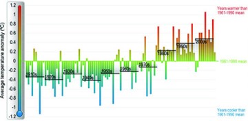
Figure 1.1(sourced from the Bureau of Meteorology) shows, in graphical form, average temperatures in the 1950s distinctly higher than in the 1940s, higher again in the 1960s, and higher again in the 1970s. Black horizontal average temperature lines for each decade are superimposed on the graph in case we don’t get the point. What the heck did it mean? How could it be squared with global cooling fears of the 1970s?
The only ready explanation that came to mind was that Australia’s experience was different from the global experience. I sought information from the Bureau of Meteorology. They were extremely responsive and helpful, providing me with useful information and with links to various temperature series. I have no idea of what they thought about the Government using their data for its own propaganda purposes. I didn’t ask.
I don’t want to quote the BoM’s response to me because it was a private email exchange but I think it is okay to say that they confirmed what is generally known, which is that using any single region can be misleading when it comes to depicting trends in global temperatures. And, certainly, it is in this case. And the Australian Government would surely have known that.
The first port of call for those examining historical global temperature trends is the HadCRUT (land and ocean) data produced by the Hadley Centre Climatic Research Unit in the UK headed by Phil Jones. I examined their monthly global temperature data from 1940 through to 1979. This data shows that global temperatures were on average lower in the 1950s than in the 1940s (by .08 degrees) and while they increased a little in the 1960s and again in the 1970s they were still lower on average than in the 1940s (by .02 degrees). It wasn’t until the decade of the 1980s that average temperatures exceeded those in the decade of the 1940s. To verify this result, I examined the data issued by NASA’s Goddard Institute of Space Studies headed by James Hansen. This data showed exactly the same pattern of global temperature variations when comparing the decades from the 1940s to the 1970s, albeit with slight differences in magnitude.
This global data presents a radically different picture to the one the Government presented. The graph would look quite different and provides less of a picture of pernicious inexorable “climate change”. That wouldn’t suit the Government at all. To paraphrase Groucho: “we have facts we don’t like them so here are some others”.
You will notice how the reference to figure 1.1 is included at the end of the sentence which refers to global warming. To then go on to say that temperatures in Australia have risen consistently in each decade since the 1940s is calculated, I believe, to give the false impression that global temperatures followed the same course.
In this cynical age, some people might say, so what, that’s what politicians do. None of us should succumb to that kind of cynicism. We know the Government and Opposition push their own barrow when representing their respective policies. We can take account of that in forming our own view. At the same time, we are entitled to expect, and should insist on, integrity when it comes to the provision of evidence and information paid for by taxpayers. If man-made warming is a problem it is a global one. People, taxpayers, voters, who know nothing about climate science ought to be able to rely on the Government to give them relevant evidence and information, not selective evidence and information dressed up as though it were relevant. It would have been as useful and as equally misleading for the Government to have shown temperatures for Outer Mongolia as for Australia. The thing that comes out of this yet again is that “the Government I lead” can’t be trusted simply to tell the whole truth if it doesn’t fit its agenda.

