 Sign In
 0 Items (
 Search


 In March, 2013, Professor Tim Flannery claimed his Climate Commission had “discovered” no less than 123 records had been broken in the December-to-February period and that it was “highly likely that extreme hot weather will become more frequent and severe in Australia and around the globe over the coming decades.” Since then the Climate Commission has lost the Abbott government’s support and has become the Climate Council, entirely dependent on private donations.
But guess what? Under Flannery’s continued leadership it has increased the number of allegedly broken records to 156 and, inevitably, the public has been assured that we have all endured yet another “angry summer.” “Perth had its hottest summer, Queensland had its hottest day, Adelaide had 11 days over 42C, Melbourne had 4 days in a row over 41C and even our politicians in Canberra had 2 days,” Flannery asserted.
“This is the critical decade”, he continued, for taking “urgent and deep reductions in the emissions of greenhouse gases”. Flannery must be well satisfied with the supportive references by warmists in The Sydney Morning Herald, one of whom advised readers of their hopeless selfishness. “You can never get cool except by means that make the warming worse”, they were informed. The deputy director of the Australian National Centre for Public Awareness of Science at the ANU weighed in with “humans are buggering up the climate”, and an assistant professor of philosophy asserted “the funding of climate denial to be criminally and morally negligent”.
Doubtless the fifth report by the IPCC, already leaked but due to be officially released on March 31, also will provide support for the warmists’ catastropharian creed. According to the Fairfax press (which claims to have seen the “final” draft), it “details a litany of global impacts including the displacement of hundreds of millions of people, reduced crop yields and the loss of trillions of dollars from the global economy.” Somehow, in its litany of coming climate woes, the Herald failed to mention plagues of toads and rivers running red with blood.
What has happened to published temperatures?
Last year, Quadrant Online published my analysis of the claims by Flannery and his troops and also a more comprehensive “Why the IPCC should never be taken seriously”. Both contained graphical constructs by physicist Dr Tom Quirk and revealed temperature lines suggesting that any claimed records were in no way indicative of a worrying trend. This year Dr Quirk’s updated graphs add to the uncertainty about the IPCC’s conclusions and its temperature projections. He also casts major doubt about the accuracy of the official upward movement of temperatures, particularly those published by our Bureau of Meteorology.
First, while the annual average temperature for Australia increased quite sharply in 2013, the graph below shows that our summer months (December to February 2014) experienced a slight reduction, with the BOM showing that drop to be a quite sharp half a degree. Note, also, that since 1980 there have been several average summer temperatures as high or higher than in 2013-14. Clearly, it is normal to have quite wide temperature fluctuations from summer to summer.
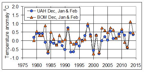
Note: BOM data is surface data from the Bureau of Meteorology. UAH data is satellite data from John Christy, University of Alabama at Huntsville.
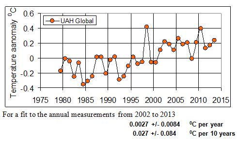
Second, data from satellite measurements shows that the global annual average temperature for 2013 was similar to, or lower than, those of some recent years. Further, it is now even clearer than before that there has been no substantive change in annual global average temperatures over recent years. For comparative purposes, this is conclusive for the period since 2002. And while the temperature in 1998 includes the “high” associated with that year’s El Nino event, it is arguably so over that longer timeframe. The increase from the late 1970s to 1998 was due to natural causes, and the hiatus since then has occurred despite the continued growth in CO2 emissions.
Are the published temperatures accurate?
Third, in assessing the trend in temperatures account also needs to be taken of the possible upward bias in published data. There are, in fact, serious doubts about the accuracy of the temperatures published by official agencies and used by the IPCC. One of the reasons for doubt is that these published temperatures are calculated by averaging only the minimum and maximum recorded for the day. But if the daily averages are calculated more properly by averaging temperatures every 30 minutes a vastly different picture emerges.
Such data is available and Dr Quirk has done the calculation for 101 days in March to June 2013 in two locations.

For a location on the east coast (Cairns), the result is on average markedly lower than the published average. In short, the existing maximum and minimum method of calculating averages produces a systematic upward bias, probably as much as 0.3-0.4C of a degree. If Australia’s official temperatures display an upward bias so, too, will any modelling of future temperatures. These systematic errors also apply to other continents where maximum and minimum thermometers are used for land temperatures.
Another reason for doubt is that there appears to be a failure to take account of the urban heat island effect. In urban areas temperatures recorded include the effect of heat retained by buildings. Dr Quirk has tested this by comparing the Bureau of Meteorology recording site in Melbourne with that at Laverton for the period from 1940 to 2010. Given the commonalities, urban heating is clearly the main reason for the significantly larger increase in the minimum recorded for Melbourne.
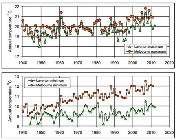
BOM records of direct maximum and minimum temperatures at the BOM office in Central Melbourne and at Laverton airport
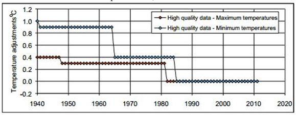
Adjustments made to the direct BOM Melbourne office temperature records to give “high quality” BOM temperature records
However, the BOM’s published temperatures appear to make no allowance for the effects of urban heating, and there also appear to be other upward biases influencing the published data.
The Recognition of Alternative Views
The increasing questions about the temperature data used by official agencies have contributed to the increasing recognition of views taken by sceptics. This is not the place to examine this development in any detail but the following reflect it:
- The American Physical Society, the world’s largest body of physicists, is reviewing its stated attitude on climate change and has held discussions with three prominent and sceptical scientists. Its previous attitude did not allow for sceptical views;
- On April 9 the Heartland Institute in America will publish Climate Change Reconsidered 11 at the National Press Club in Washington, DC. This has been produced by the Nongovernmental International Panel on Climate Change and I contributed to the review of one of the volumes. Under the heading “Benefits of Global Warming Greatly Exceed Costs, New Study Says“, an advance press release states that this report identifies the almost complete failure of the IPCC to take account of the numerous benefits of rising temperatures and CO2 as revealed in thousands of peer-reviewed studies; that the IPCC has falsely claimed that climate change will injure coral and other forms of marine life; and that it has failed to recognise that fossil fuels will “continue to be safer, less expensive, more reliable and of vastly greater supply than alternative fuels such as wind and solar.”
- On March 6, in conjunction with Case Smit, Director of the Galileo Movement, I petitioned the Parliament for support for an inquiry to be held into the costs and benefits of current climate government policies designed to reduce emissions. Dr Dennis Jensen MP presented the petition.
- In an address to Parliament on 25 March Dr Jensen reported on exchanges he has had with the BOM and suggested that its published “adjusted” data appears to have been “manipulated”. Also, that there are questions about its why it does not publish data back to 1850, even though the IPCC does so.
Any objective appraisal of the evidence, such as it is, testifies to the grave and growing doubts about the alarmist utterances of Flannery and many others. The time has come for Australia to take the lead and institute an independent inquiry into the costs and benefits of government policies designed to reduce emissions of CO2.

