 Sign In
 0 Items (
 Search


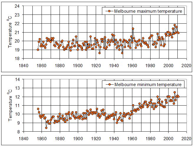
For more than 150 years temperatures have been recorded near the centre of Melbourne. Maximum and minimum temperatures were carefully measured. The two examples below show that in the afternoon, the sun, in the words of Lewis Carroll, was “shining with all his might”. The minimum, mostly recorded in the early mornings, shows the increasing energy carried in the atmosphere after 1950, if you are a warmist, or the urban heat island effect if you are not. Then again, perhaps it represents a little of each.
Given that readings were taken once a day, no continuous daily records based on measuring temperatures, say, every three hours were available. But now, with electronic thermometers, computers and networks, all things are possible — a development the Bureau of Meteorology (BoM) has demonstrated by recasting the temperatures for the site and constructing its own "mean temperature". Three questions arise:
1/ Were old thermometers replaced by better and more accurate ones?
2/ Did the thermometers move as the observatory and office moved about Melbourne?
3/ How did the BoM measure the mean or average temperature?
The average temperature should be what we all understand an average to be. If we want the daily mean temperature, we average readings taken as frequently and regularly as possible through the day and night. Of course, with an automatic weather station we can record all sorts of numbers for the meteorologist to consider.
But what do BoM meteorologists do? They average the minimum and maximum temperatures and call it the mean. If similar logic were applied to a man with one foot in boiling water and another frozen into a block of ice, the resulting mean would suggest he is happily situated, comfort-wise
The BoM seems to have ignored this problem. We now have two assessments of the temperatures, the “High Quality” temperatures of the Australian Climate Change Network and the “ACORN-Sat” time series, better known as the Australian Climate Observations Reference Network – Surface Air Temperature (series).
The adjustments made to the direct temperature measurements show what can be achieved. In the Bureau’s own words, the data has been “homogenised” by using measurements from nearby sites.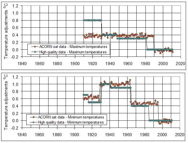
A natural question to ask: Do the abrupt changes shown in the graphs correspond to the use of replacement thermometers or, perhaps, to changing their locations?
The maximum and minimum thermometers are paired and mounted on the same board or kept within a common enclosure. It is not obvious from looking at the history of the Melbourne site that any of the temperature adjustments are due to changes in instrumentation or physical relocation, where you would expect simultaneous adjustments of minimum and maximum temperatures.
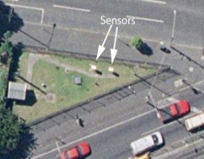
They seem to have been drawn from readings at the corner of Latrobe and Victoria streets from at least 1908, when horses and cable trams were the city’s primary means of transport. As can be seen from the aerial photograph (below) the monitoring site is on a traffic island at the intersection of heavily trafficked Victoria and LaTrobe streets, at the northern edge of Melbourne’s CBD.
The BoM’s procedure looks problematic. The adjustments have been made at different times with both increases and decreases. A comparison of the two time series shows 10-to-20 year differences of as much as 0.4 0C temperature. (As a sidelight and, perhaps, a comfort, the East Anglia Group, whose Climategate emails prompted such a storm, do not use these “high quality” data; rather, they make their own adjustments!)
These BoM temperature series are used to construct the mean Melbourne temperature by simply averaging for the day, month or year.
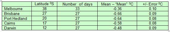
So let us now return to see if the reported “mean” temperature is a good measure of the mean temperature? An example of the daily temperatures variations at the Bureau’s Melbourne office is shown below for 33 days in March and April, 2013, of which 28 are a continuous series. The error bars are the errors on the mean for each of 48 temperature estimates, plotted 30 minutes apart and spread through the 24 hours of the day.

The mean temperature is 18.94 0C and the BOM “mean” is 19.29 0C. Thus, the mean is 0.36 +/- 0.10 0C less than the BOM reported mean.
Other sites in Australia show larger distortions.
These examples indicate significant systematic distortion of the reported mean temperatures. It should be noted, however, that a full year is required to establish the extent of these systematic distortions.
There is a clear need for a re-examination of the utility of the present adjusted Australian temperature record, where the mean values may well have been overstated by amounts similar to the adjustments made to the original records.
If the mean land temperatures are overstated from averaging minimum and maximum temperatures and the air temperatures over the oceans are measured mean values, then the blending of the two data sets presents difficulties. There is a further problem as computer models generate mean temperatures, so comparisons will in turn overstate feedback effects.
So while the Bureau is certain of our future, the past is proving unpredictable.
Tom Quirk trained as a nuclear physicist at the University of Melbourne where he took courses in meteorology. He has been a Fellow of three Oxford Colleges
