 Sign In
 0 Items (
 Search


For the first time in 15 years Quadrant has had a major redesign.
• Better quality paper,
• perfect binding,
• new Caslon typeface,
• new cover design.
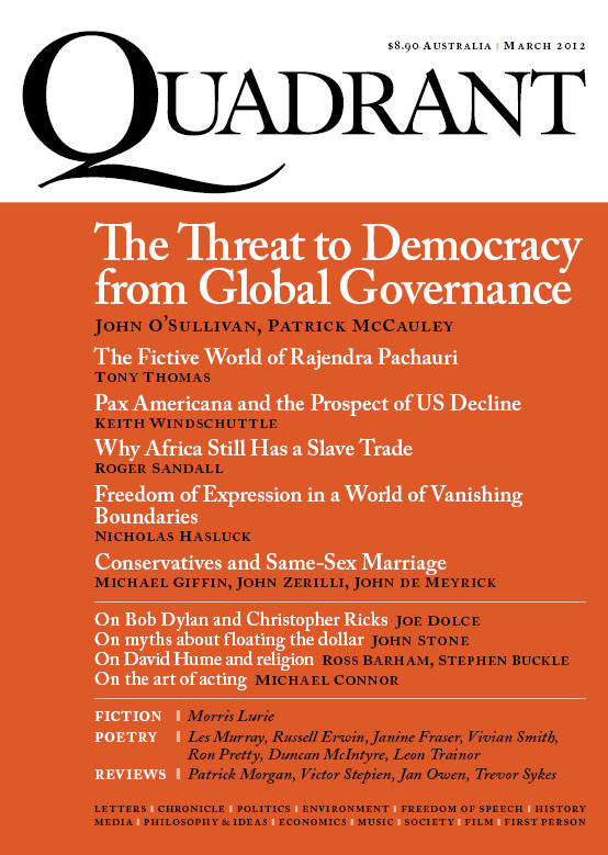
The Quadrant cover has been redesigned by Graham Rendoth of Reno Design, Sydney.
Graham has produced a quintessentially Australian colour palette for our ten editions for the year.
The March 2012 edition has an iron-ore red that Graham has named Hammersley, this will be followed by Ochre in April, Eucalypt in May, Grey Gum in June and so on throughout the year.
(For a larger impression of the March cover click on image above.)
While the colours reflect Quadrant’s distinctly Australian perspective the cover stories on our March edition demonstrate how international are our interests, with articles on the rise of global governance, the decline of the USA, the head of the IPCC, the slave trade in Africa today, free speech in a globalized world, David Hume and Bob Dylan.
Quadrant editor Keith Windschuttle comments:
Changing the design and printing of Quadrant means a significant increase in our costs.
I am hoping we can cover this by increasing the number of subscriptions to the magazine.
Subscription revenue, rather than casual sales, is our lifeblood.
I hope the improvement in quality will persuade enough new people to become subscribers to make it all worthwhile.
Join Quadrant’s supporters & subscribers today.
It’s never been easier. Subscribe here…
