 Sign In
 0 Items (
 Search


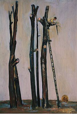
 The moment of creative transition for Fred Williams (left in 1983) is signalled by a painting he completed after he had been in London nearly four years. Tree Loppers, a large oil of 1955, marks that step where the promising youngster metamorphoses into a mature artist.
Williams was twenty-eight years old, single, and sharing a tiny flat in South Kensington. It was a huddled grey neighbourhood, a low-cost magnet for colonial expatriates and East Europeans: locals had taken to calling certain streets the “Danzig corridor” due to the resident Polish refugees. But Williams counted himself lucky because he was only two streets from the Victoria and Albert Museum, and he had left Australia to immerse himself in museums, to get the measure of great art, to grow creatively. He was in Britain for serious toil.
 Having found a part-time job as a picture framer, Williams worked assiduously. He drew every day, taking ideas from sketches through to gouaches and small oils on board. And he enrolled at the Chelsea Art School to use—it is customarily said—evening life sessions to draw from the model. However, its main attraction was the student canteen. These were the days of “austerity Britain”. Food rationing was still in force when Williams arrived, and he was among a throng of hard-up Commonwealth painters who habitually ate there because they couldn’t afford much else.[1] That canteen was also where they made friends, picked up gossip, discussed their own efforts, and heard what exhibitions were worth seeing.
Tree Loppers (right) shows what Williams assimilated in the foreign city cohering as a mature statement. Set in a palette of dingy umbers and tan with dabs of prussian blue, the composition functions on one plane: there are no distractions. It portrays a huddle of five lanky trees, quite denuded of foliage, the short stumps of cut limbs jutting from their bare elongated trunks. A tiny man, who is determinedly sawing through a thick bough, sits in the crown of the right tree, just above a long thin ladder at a slight lean. The greyish sky hangs behind like a heavy blank curtain, preventing any view. There are no ploughlands or pools, no dragonflies or cowslips. Like a scene on a shallow stage, all is foreground.
Tree Loppers is the largest work Williams produced in London. It was painted on masonite, a stretched canvas being beyond his means. The panel was sawn to three feet four inches by two feet three inches, adhering to one of the standard sizes then used by professional artists. In using these dimensions Williams could readily compose his work with a (pre-metric) design grid to establish geometry. This is evident from his measured placement of trees and lopped boughs. Most telling is a seven-inch-wide vertical strip along the picture’s right side, showing the artist used a “golden section”, with the workman set at this format’s upper transection point.
Given his subsequent career as a landscapist, more is at play in this early oil than we expect. There is a cryptic allusion carried in the design. Tree Loppers is a version of the “Deposition from the Cross” motif from Italian baroque art. Traditionally such paintings depicted three crosses close together, with a male figure atop a ladder who lowers the limp body of the dead Christ. This format is adapted with minimal changes: the layout of Williams’s bare trees with jutting boughs plainly evokes three crosses, and, if there is no body, his workman is in the customary funereal position.
What are we to make of this? Fred Williams was not a religious artist, and it would be rash to impose sacred symbolism here. The painter was showing his prowess by inventively using an Old Master motif. But the pathos and brooding drama of a design used to set the viewer meditating upon existence are carried over to this sad, lonely scene. Nature has been crucified.
The rural motif evolved from an etching and several drawings in pen and ink. They depict workmen removing trees along a country lane—a commonplace activity Williams noticed on a painting excursion to Sussex. This subject matter is significant. It smacks of a notorious band of emerging artists on the mid-1950s gallery circuit.
London’s art scene was at low ebb when Fred Williams arrived. War had been over for seven years, but the next creative generation had failed to materialise. Young painters were still in the thrall of the 1930s modernists: Piper, Sutherland, Nash, Nicholson, Ravilious, Bawden, Moore. Two of these idols were dead, the rest had slid into droning repetition, and Henry Moore wasn’t a painter. There were no signs of an assertive new wave breaking onto the tame exhibition scene—until 1954.
All writing on Williams’s London sojourn has stressed his interest there in Old Master works, as well as the probable influence of Edwardian paintings by Walter Sickert; although it ignores those contemporary exhibits he saw, or where he collided with Sickert’s scenes of informal city life. He was regularly nosing around the leading West End galleries; the Redfern Gallery, a reputable firm in Cork Street, tried him out as an exhibitor. And before they took a punt, art dealers needed to see untried painters frequenting the exhibition circuit, proving their professional commitment.
One commercial venue in Mayfair that Williams surely visited often was the Beaux Arts Gallery in Bruton Place, off Berkeley Square (three streets from the Redfern), run by the energetic art dealer Helen Lessore. Emerging artists flocked there.[2] It was the action place. Lessore hung prominently in her office The Servant of Absalom, a painterly late self-portrait by her deceased brother-in-law, Walter Sickert. And Lessore let it be known she tested the quality of potential exhibitors’ pieces by holding their work beside this aesthetic talisman.[3] It was a challenge youngsters couldn’t resist. So throughout the decade, besides fostering interest in Sickert’s canvases via stock shows, Lessore’s gallery signed up many emerging modernists committed to extending the limits of image-based painting with a dark outlook. This zeal led her to exhibit Francis Bacon in 1952, while Frank Auerbach and Leon Kossoff had their first solo shows with her in 1957 and 1958 respectively.
After Williams had been in London for nearly two years, Lessore began promoting a brash group of youngsters the critics dubbed “Kitchen Sink Realists”.[4] The passage of time has blurred divisions, so this 1950s trend should not be mistaken as a visual arm of the “Angry Young Men”—English writers whose forlorn novels and plays focused on a young aspirational male trapped by social mores in the convention-conscious counties.[5] Instead, the Kitchen Sink painters revelled in the grubby poetry of everyday life: they depicted the clutter of warehouses, portraits of whippety men and their indomitable wives, fish-and-chip suppers presented as still life, pigeons splashing in a gutter, that immediate world of Woodbines, flat caps and Brylcreem. They also stood out on London’s politicised art scene, with its Cold War squabbling over how to paint, because they embraced modern means.[6] Edward Middleditch applied oils as lush slabs of vibrant pigment, Peter Coker stylised his drab subject matter with a spiky graphic quality, and Prunella Clough rounded figures and objects so that they fitted snugly into their environments.
Kitchen Sink Realism was the key movement of the day, influencing the rising generation to paint images of lower-class life. Opinion was so high of a group exhibit Lessore arranged in 1955 that four of the artists (Middleditch, John Bratby, Jack Smith and Derrick Greaves) were chosen to represent Britain at the next Venice Biennale. And in its aftermath, Sir Kenneth Clark smoothly moved in on the circle, lining up a plum commission for Bratby to craft paintings for the 1958 feature film The Horse’s Mouth, while trying to brush aside Lessore.[7]
Tree Loppers proves the role of this creative climate in shaping Fred Williams’s outlook. At this time he had been working up compositions based on music hall performers, and lower-class people going about mundane toil. There were gouaches and etchings of a window washer, a woman having a haircut, a cook punching in at a time-clock, two buskers, coalmen, people in bars, pigeons fed crumbs on a window sill. These were thoroughly in tune with the down-at-heel interests of young London artists under the sway of the “Kitchen Sink” trend. Williams’s painterly application—that animated brushwork in Tree Loppers, those deft dabs of highlight—is characteristic of the time and place. His approach is emphatically contemporary.
Did the dingy palette Williams acquired in South Kensington register some aspect of his experiences there? Heavy fogs were a renowned feature of the capital city for over a century, although air pollution had intensified and became more acidic after the war. It was a vile mix of diesel exhaust, a toxic sulphur compound produced by new chimney filters fitted to Battersea Power Station and, predominantly, coal smoke.
Even in warm weather London was always smoky. Besides powering railway locomotives, coal was the staple cooking fuel until the mid-1950s, and it remained the heating source of choice for longer still.[8] Nearly everyone had coal fires at home, sometimes a hearth in each room, and they lit them except on the hottest days. This fouled the air in colder months (“It was a beastly January day, with a dirty yellowish-grey sky,” begins George Orwell’s aptly-titled novel Coming Up for Air[9]). And it caused a relentless fog from autumn onward, blotting out streets in murk on bad days, casting a coffee-brown pallor across the visible world on good ones. You would go into a corner shop for groceries, then step outside again to find a smelly miasma had descended. It was often so bad one couldn’t see three yards ahead, giving the back streets a sinister ambience at night, and muffling sounds. No wonder the fugitive convict Magwitch, and the uneasy ghost of a murdered king, were set lurking within vaporous gloom in locally produced film versions of Great Expectations (1946) and Hamlet (1948).
Expats arriving from Commonwealth countries were appalled at London’s fogs, how much dirt was borne by the chill air one breathed. The Melbourne painter Albert Tucker recalled a sooty grit gathering in his spittle when he walked outdoors. Arriving to “sepulchral gloom at four o’clock on a November evening”, the Canadian youth Michael Ignatieff was repelled by a “pervasive dampness, fog and chill everywhere”.[10] The Jamaican writer Sam Selvon used that murk to symbolise a sickly aspect to the cold drab city at the beginning of his evocative novel The Lonely Londoners (1956):
One grim winter evening, when it had a kind of unrealness about London, with a fog sleeping restlessly over the city and the lights showing in the blur as if it is not London at all but some strange place on another planet, Moses Aloetta hop on a number 46 bus at the corner of Chepstow Road … When Moses sit down and pay his fare he take out a white handkerchief and blow his nose. The handkerchief turn black and Moses watch it and curse the fog. He wasn’t in a good mood and the fog wasn’t doing anything to help the situation.[11]
Artists from warm climates were alert to a pervasive haze. It was not that the familiar intensity of clean sunlight was lacking, or how accumulated pollution everywhere soiled brick and stone, even the bark on trees. The quality of space outdoors, its colour and depth, was utterly different to what they knew: streetscapes were seen through a russet filter, distance was distorted, there was a smothering blur to the air. Some of these qualities are plainly evident in the screen-like sky to Tree Loppers, which has the distinctive hue of London pollution.
Actually, Fred Williams endured the worst of the city’s fog, and, stricken with asthma, his health suffered.[12] He lived through the historic “Great Smog” of 1952 when, in mid-December, a sulphurous thick vapour lolled heavily upon the city for five unbroken days: “It was simply dreadful. Visibility about six feet. And it got down the throat & nose & stung like pepper,” one diarist recorded for Mass Observation.[13] London was paralysed. Businesses closed. Traffic effectively stopped. The bus service was suspended. Policing was reduced to foot patrols, with constables walking cautiously along pavements using the gutter as a guide. Night was fearful as streetlights were unable to illuminate the dense smog.
By the third day the smelly vapour was penetrating homes and public buildings. Cinemas halted screenings as the flickering beams of movie projectors were diffused by hazy air. La Traviata was cancelled at Sadlers Wells because the audience couldn’t see the stage; likewise for a concert at the Royal Festival Hall. Calls for medical assistance soared. Not only asthmatics, the sick and elderly were distressed—as were ailing stock in an Earl’s Court agriculture fair.[14] Everywhere people succumbed to coughing fits, or phlegmy choking, or bronchial wheezes. Then the ambulance service halted for safety’s sake, leaving it to family or friends to get the sick to help.[15] In a final reckoning the “Great Smog” was responsible for 12,000 fatalities; during its six peak days the effects on the city exceeded both the 1866 cholera and 1918 influenza epidemics.[16]
His stay in Britain during those foggy years saw Williams rethink skies, their tint and depth. They are made to look grubby in his pictures, with blue replaced by mustard yellow or a sienna-tinged grey, the typical hues of inner-London pollution. His oil paint can also be thickened as if the air has a dense physicality, sometimes being finished with textured brushstrokes. Space will be compressed so a view into distance is cancelled: backgrounds are missing.
Besides the recurring signs of smoky air, coal makes a featured appearance in Williams’s London work. Horse-drawn wagons delivering the ubiquitous fuel were a daily sight around the cobblestone streets. Williams made numerous drawings of the deliveries, culminating in a robust oil painting of two hessian-clad coalmen hauling bulky sacks into his building.
Returning to Melbourne late in 1956, Fred Williams was offered use of a room in the city for a studio. At the top of narrow stairs above a plumbing business, it was small, cramped and dusty, and overlooked busy Exhibition Street: not the expected workspace for a future landscapist. He was in there painting most mornings, often all day on weekends.
Writing on Williams can give the impression that he was a solitary man. However, he was popular, always present at gallery openings and artist get-togethers. He was among a circle of emerging figures, including Leonard French, Arthur and David Boyd, Ian Armstrong, Clifton Pugh and John Brack. They were competitive, opinionated, determined, pushy: nowadays they would be called “networkers”.
Still, his own production was uneven. “The paintings of 1957–60 are in some respects the weak link of Williams’s career,” the curator James Mollison admits. “Confused about what he should paint and how he should paint it, he began pictures vastly different in subject matter and approach …”[17] He was taken on by Australian Galleries, the chief Melbourne venue handling modernists, although its director Anne Purves told me Williams was unsure of what to focus on. He wanted to display samples of all he had going: figure studies, landscapes, still-life.
Sales from his first show in 1957 were meagre, little sold from his second in 1958, then next to nothing in 1959: because his semi-abstract works were difficult. Actually, the bush landscapes from his second exhibit are still hard to grasp, with their claustrophobic space and sombre palette of ochres and rusty browns—qualities which infused the pictures with a drab, miserable mood. “Williams makes no concessions,” his friend John Brack observed in a review. “They are gloomy in the way the country itself is gloomy. Not prettiness but truth.”[18]
 Sherbrooke Forest number 2
All that came later relied on those misunderstood, distinctly unappealing works, now referred to as the Sherbrooke Forest series. Curators vaguely suggest the artist’s formal development if mentioning them, yet this is to miss the point. Because the legacy of Europe tells in those pictures. Take his subject decisions. “Kitchen Sink Realism” valued the monotonous, the ordinary, the everyday: it raised things so unremarkable and boring they seem beneath art. And herein lies the difficulty in appreciating the artist’s forested landscapes.
What Williams valued is long out of fashion. When it comes to art following the Second World War attention is now fixed on New York’s Abstract Expressionists and their successors. Today’s art history curriculum in Australian universities and art schools omits 1950s European art. America constitutes the post-war creative mainstream: the rest is void. According to this tunnel vision, Fred Williams travelled to the wrong place, looked at the wrong exhibitions, picked the wrong themes, then made the wrong sort of pictures.
In keeping with a down-beat European sensibility, Williams was drawn to landscapes that were ever-present, those neglected zones at the outer edge of Melbourne’s suburbia, such as Olinda and Sherbrooke. If he was not the first to paint the areas, local artists habitually tricked up their canvases using picturesque mannerisms. And Williams stubbornly would not sweeten these landscapes or inject a visual serenity—to paraphrase his close friend John Brack, Williams stuck with their characteristically Australian ugliness.
 This choice of subject surely affected formal means, for Williams set down native bush as a screen of trees. In oil paintings and gouaches, he translated forests as a row of rod-like trunks standing side-by-side across the composition. Some works, depicting bush seen at a distance (including Black Creek, Nattai River and Landscape with Steep Road, all of 1957-58), had slim trunks taper into gathered spherical shapes connoting foliage; others, giving the view within thick bushlands (like Forest Pond, Landscape with Building and Sherbrooke Forest, all of 1958-59), had wide vertical trunks run up the picture, disappearing off the top edge. In either case, extending a format embedded in Tree Loppers, Williams portrayed bushland as a chorus line of trees parading before a curtain-like mahogany background.
Landscape pictures are in effect visual texts in which attitudes about the world are transmitted. This is why urban dwellers relish views of open countryside under clear light, particularly sights of a self-evidently national landscape; because the patriotic feelings such works stir is mated with an image of freedom, the sense that our nation is large and we are at liberty to move within it unrestrained. But the ambience these forest pictures by Williams convey is severe. Australia generally—and the Melbourne scene, in particular—is cast as miserable, stifling, monotonous and bleak. The dismal bush closes in on us, with massed tree trunks plainly suggesting rigid bars. His gums confine and cage.
The artist himself saw his Sherbrooke paintings as adapting cubism, which he had studied through two illuminating London exhibitions of Georges Braque.[19] The appeal of the French modernist to Williams is telling. If he possessed an innate sense of vocation, Braque was neither a distinguished draughtsman nor a notable colourist. His studio production was uneven and it takes an acute eye to distinguish his best work. Yet he was disciplined, determined to push paintings through to a scrupulously crafted resolution. And in his late dark interiors Braque evocatively conveyed post-war forces that smother and enclose.[20]
Williams’s palette echoes Braque’s brown-green chords, although what the Australian mostly ingested from his oeuvre involved distance. Indeed, when Williams spoke of using cubism, he seems to have meant not geometrising forms, but dispensing with spatial recession. Hence his late 1950s landscapes are not views. They are not designed to suggest scenery extending to a horizon. Instead he tilts the terrain sharply so it runs steeply upward. This gives countryside its frontal quality, with dark forests pressing forward in a claustrophobic manner.
Some of these traits seem carried over from the distorted, compressed space of London. But Williams was also responding to the tightly composed post-impressionist landscapes of Cézanne, which had alarmed audiences for generations by dispensing with perspective and denying depth-of-field. This is probably why the accepted signals for distance are lacking from Williams’s paintings. Like Cézanne, his non-spatial views avoid suggestions of backward recession, and, when included, the horizon sits on the surface as a thick line of paint.
Overriding design decisions is the palette, Williams’s colour and tonal range. There is a shabby cheerless mood in the dingy browns which give his bushland an airless, rather smothering quality. It also produces a disquieting sense that this forest is barren. If, in some gouaches, a few zucchini green flicks denote new growth sprouting from trunks, the colour of fertility is absent in the oils, while the water shown lying in creeks is black and rancid. Design, colour and tone operate together to put these among the most unflattering images painted of the Australian landscape—which is why museums prefer to keep them in storage.
Then, on a painting trip with Arthur Boyd to Echuca in northern Victoria, Fred Williams perceived the landscape in a different way. He made studies where he abbreviated trees as dark vertical lines, and worked up his oil pigment in the gaps between trunks. His attention had shifted: Williams was absorbed in the intervals between trees.[21] This shift was consolidated in his studio, where sections of the paint surface became progressively dense and textured. The artist thinned right out the former screen of tree trunks, and worked up as his background into a loose tan surface like peanut butter mixed with grit.
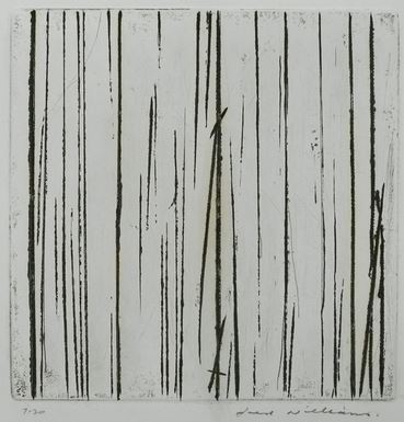
Easily surpassing the initial Sapling Forest paintings, as they came to be called, Williams’s chief achievement with this new series lay in etching. In those days, due to the generosity of the Melbourne Technical College, there was for professional artists open access to the printmaking workshop every Friday. Williams slipped over from his nearby city studio each week. Others who used the facility recall him experimenting with inks, paper and print pressure, striving to excel. Besides his own materials, he would try out whatever was at hand, using inks and discarded slices of paper left around the benches. This has led to the reverential labour of later museum curators who, like philatelists fretting over postage stamps, have struggled to identify and catalogue every variation of each print Williams attempted there (a source of continuing hilarity to artists who saw the prints made).
The Sapling Forest etchings of Fred Williams are difficult to grasp, because they were not printed copies of any painting. Instead, he relentlessly refined each composition, pushing it to states that oil paint was incapable of achieving. He etched into each plate a configuration of vertical lines indicating skinny tree trunks, then used 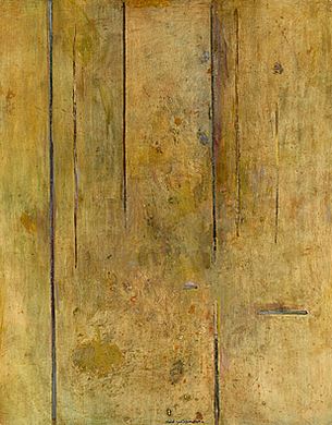 aquatint to add areas of tone in the gaps between. He would then progressively etch and etch again, burnishing out lines, sometimes adding others, working the tactile aquatint to form grainy surfaces of immense subtlety. Touch is important, although there was also Williams’s changing approach to geometry. There are no grids, yet each composition has an almost Palladian visual equilibrium, a veiled symmetry. Measure and balance are crucial to these serene etchings. The results are minor masterpieces, the visual equivalent of a subtle performance by a concert pianist.
The Sapling Forest paintings and prints — one of which is reproduced at left — were affected by American abstract expressionism, which had now taken the international art scene by storm. But there was no direct stylistic influence from the United States. Any similarity between Williams’s verticals and the “zip” motifs of Barnett Newman’s stately abstractions was coincidental.[22] The Australian had seen New York School paintings only via black-and-white photographs in art magazines, with the few gestural paintings he directly encountered being by local practitioners. This explains the tactility of his abstracted forests, and their earthy palette—features then characteristic of the leading Sydney abstractionists Stan Rapotec and Peter Upward. Besides, Williams’s efforts were not instances of expressive release. Art did not come forth in a hurried rush.
There was another overt influence on Fred Williams inexplicably absent from the published literature. The terms for recent art, especially landscape painting, changed profoundly in 1960 with the release of the landmark book Art and Illusion: A Study in the Psychology of Pictorial Representation. Penned by the distinguished scholar Ernst Gombrich, this plentifully illustrated and lucidly written history was the most commercially successful art book of the 1960s: it went through four editions by decade’s end.
Gombrich’s reach was immense. Not only artists and designers absorbed his ideas. Michelangelo Antonioni’s famed 1966 film Blow Up, for instance, manifestly draws on the book’s sixth and eighth chapters. Likewise, inspecting Fred Williams’s paintings of the early to mid-1960s, central themes on landscape presented by Gombrich are restlessly confronted and inventively quarried.
Art and Illusion gave substance to T.S. Eliot’s claim that truly original talent draws from tradition even as it shakes up and reconfigures that tradition. Gombrich did this by adapting the philosopher Karl Popper’s views on scientific advancement to posit that ground-breaking artists employ “making-and-matching”. This neat phrase describes the process where an individual painter takes an established schema (or pictorial formula), then adjusts it according to changing requirements. First comes schema, then correction. With landscape painting, Gombrich demonstrated, the young John Constable arduously copied drawings classifying cloud effects by his predecessor Alexander Cozens. Constable used these as initial models for his own skies, gradually adjusting and moving on from them as his grasp of atmospheric effects grew. Like Popper’s scientist, Gombrich reasoned, an artist works from received knowledge, using gathered data to correct depictions of nature as needed.
This explanation of cultural progress struck an instant chord with many landscape painters; indeed, it became an orthodoxy taught across Australian art schools. Factors like the pressure of naturalism or modern techniques have not chiefly propelled stylistic change, it was claimed, with major landscapists—like Constable and Cézanne—being likened to scientific or philosophical pioneers who change our understanding of the visible world.
Contrary to this abridged view of his landscape thesis, Gombrich then pondered if Constable owed more to paintings by others than to direct observation. Constable had stressed in letters that he learnt to visually comprehend real countryside through studying pictures by Gainsborough, Wilson, Dughet, Claude, Cozens, Ruysdael, Cuyp and Rubens. This leads to an enigma over how pictorial schema may influence our perception of nature. Citing the findings of several psychologists, Gombrich suggested that major artists might teach us to discern previously unappreciated landscapes: “Nature could never become ‘picturesque’ for us,” he wrote, “unless we, too, had acquired the habit of seeing it in pictorial terms.”[23]
Art and Illusion then proceeded from conventions and formulas to related themes within landscape art. One was the “accidental image”. This is when artists take random blots, smudges and marks which they modify slightly to suggest landscapes. Countless generations of painters, from the Greeks and ancient Chinese, have indulged in this amusing pastime. Using scientific findings on the Rorschach test, Gombrich reasoned that all hinges on perception (and cognition), not vision (what the eye apprehends). The viewer sees a landscape because the artist imposes schema upon disorder: particular signs or pictorial clichés, which have scenic overtones, are added to deceive an audience into seeing countryside.
From there the scholar’s musings turned to calculated roughness, that is, the inverse of the “accidental”. Since the Renaissance, Gombrich pointed out, certain artists have fashioned works which at arm’s length appear clumsy or coarse, but prove highly accomplished when viewed at a distance. This is “calculated roughness”. It is a skill readily evident in the late work of Titian and Rembrandt, and long acknowledged among professional artists as a badge of mastery. Indeed, from Velázquez through to Manet there is a flamboyance to seemingly casual brushwork.[24] It’s akin to a strut. The artist is showing off his sophistication.
This attitude was traced to Baldassare Castiglione’s Renaissance treatise The Book of the Courtier (1527) with its formative doctrine of “sprezzatura”, the swaggering nonchalance which marks out a perfect artist. And, for Castiglione, calculated roughness also distinguished the true gentleman. He was a special viewer. Gombrich elaborated:
the painter’s skill in suggesting must be matched by the public’s skill in taking hints. The literal-minded Philistine is excluded from this closed circle. He does not understand the magic of sprezzatura because he has not learned to use his own imagination to project. He lacks the appropriate mental set to recognize in the loose brushstrokes of a “careless work” the images intended by the artist; least of all is he able to appreciate the secret skill and cunning which hide behind this lack of finish.[25]
Besides flourishing his cleverness, the master would therefore use ambiguity much like the renowned duck/rabbit diagram of perceptual psychology. It took a special mindset for a contemporaneous viewer to look at, say, one of Turner’s late intensely coloured vortexes and recognise it as landscape. Most saw a painted jumble. True masterworks were meant to be savoured by discerning audiences.
The key breakthrough for Fred Williams involved his departure point. Australian distance was the barrier. How to convey its immensity? European tradition did not offer—in Gombrich’s terms—the ready base for a “making-and-matching” process, that necessary foundation to craft major paintings.
The London museums Williams had previously visited held the finest concentration of Western landscape art in the world; however, despite studying so many works, he commented to friends that few of them were of practical use to him. Australian landscapes were too unlike Old Master pictures. The light intensity and local colour, most of all the space was wrong. European customs would not hold. There was no focus in Australia’s countryside, which was what the artist sought to visualise.
Repeatedly painting sparse country near Geelong, from an elevated site in the You Yangs hills giving a view across grass plains which run unbroken to the horizon, Williams groped for a solution. The outlook seemed characteristically Australian. But, as he discussed with John Brack, such a landscape is “never picturesque. It is never intimate, but always withdrawn, remote, even forbidding.” Brack elaborates:
our landscape appears unenclosed, sprawling: it insists on continuing beyond the limits of any rectangle imposed on it. Here is a very real problem for the artist who wants his picture to amount to the classical whole, while at the same time indicating the idea of infinity. The approach to the edges of the rectangle is perilous.[26]
Old Master formulas would not apply. There were no converging orthogonals, none of those scenic fixtures that contain a view, no bunched trees jutting in from the wings. Instead, the country was planar, flattened, visually limitless. For a time Williams looked closely at the design of several Kelly landscapes by Sidney Nolan, which in their emptiness appeared to hint of a solution. He had promising results in gouache studies as he reduced the sky—used by European masters to establish mood—substituting pale grey or ochre for atmosphere, and raising his horizon. Then, in an inspired moment, Williams seized on a link with the most reductively abstract views ever painted.
Piet Mondrian evolved his plus-and-minus compositions while gazing at bare ocean from a hotel room for months on end. This was in a deserted Dutch resort town between 1914 and 1916, where the ascetic painter had withdrawn when war erupted.[27] His paintings used a pared-down vocabulary of plus-and-minus like lines to signify lapping waves. Mondrian had worked out, the scholar John Golding explains, “an array of vertical and horizontal lines, subtly and infinitely varied, which touch, cross or hover independently to create a feeling of perfect equilibrium. They also pulse and shimmer, as does the sea itself at rest.”[28] Organised as a fragmented grid, these minimal dark marks upon pale grey do not suggest space is closed. It ebbs into infinity. Indeed, a member of the symbolist movement, Mondrian aimed to suggest an encounter with something vast and transcendent—which explains his pictures’ visionary overtones, those hints of cosmic forces glimpsed via the ocean’s rhythmic flow.[29]
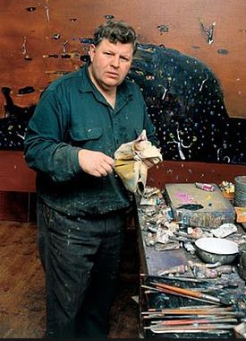
Fred Williams (above, in 1983) had taken a serious look at Mondrian over 1960-61. Using Michel Seuphor’s recent book on the pioneering modernist, Williams translated several of his own compositions into geometric abstracts reminiscent of late Mondrian; although he put the pieces aside.[30] But, as his paintings show, eighteen months later Williams tried rephrasing his You Yangs landscapes by discreetly using the seemingly limitless visual space of Mondrian’s plus-and-minus oceans. The effect of the new studio pictures was mesmerising.
Steeply tilted and with no horizon, the subject of the 1963 You Yangs paintings was a couple of distant paddocks, telescoped into close-up.[31] Williams set down a ground the colour of rich honey, over which were flecked an array of short blobs and raised dabs of burnt umber, adding a scatter of squat Indian red strokes, then finishing with touches of grey and off-white. Here was a generic Australian landscape in its featureless monotony. His staccato dashes and stroked accents of paint denoted standing and fallen trees, scrub, rock and stumps, gathered in areas to suggest fence lines in You Yangs Landscape I and II.
Williams also adapted Mondrian’s contrast between dark marks and pale surface by using a semi-transparent ground to evoke deep space, an effect stepped up in You Yangs Landscape III with a mellow tawny ground. The results were visually arresting. These majestic paintings, which hover between landscape and abstraction, had an epic quality. Most uncanny is the pictures’ sombre mood, which for many viewers conveyed an encounter with the unyielding infinite.
Williams moved from strength to strength with his subsequent Upwey Landscapes (1964–66) and the classic Lysterfield Landscapes (1967–69). If several Upwey drawings and prints do feature plus-and-minus notations amidst the blunt trees, a debt to Cézanne was hard to ignore. Williams likewise painted his obsessive pictures from patches of adjacent values, stressing balance and symmetry in what are tapestries of considered colour and texture. Much relied on the drought-dry colours of parched grass and bare earth, inflected with granite flecks and that grey-green of native foliage. These works also saw a horizon line re-enter Williams’s work, being set below a thin strip indicating sky near the picture’s upper edge. And as for imagery, the aridity of his vision relied on omission. Besides lacking blue hills and heroically weathered gums, favoured clichés of landscapists for generations, the artist avoided motifs with agricultural associations: there was no livestock, no cropping, no farm buildings, no roads.[32]
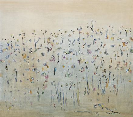 Lysterfield Landscape
When looking at a classic Williams composition from across a gallery it is self-evidently a landscape image. Highly abbreviated, yet countryside nevertheless. Then, moving closer, and standing before the canvas at arm’s length, the viewer is confronted by those emphatically physical dabs of paint. Ernst Gombrich’s point about visual notation versus painted mark within great landscape pictures, a degree of calculated roughness, is surely at play in these pieces. Are we meant to be construing trees, or enjoying brush strokes?
Good paintwork was primal for Fred Williams. When he talked it was obvious he loved his materials. He chatted with affection and insight for how paint was handled by the (mostly French) masters he admired. Williams himself never treated oil pigment as fill for pre-drawn shapes. He wanted the physicality of his medium almost to hum; as his biographer Patrick McCaughey observed, every part of a 1960s canvas was equally valued in paint.[33]
But the chief obstacle in discussing technical achievement is that Williams defies reproduction. A glossy illustration cannot show those palpable qualities that activate his finest pictures. For instance, the underlying surfaces upon which his compositions rest will deceptively appear in the art book as an even coat of paint. But Williams did not flood in a smooth base colour. And his earlier paintings were executed on panels which he prepared with a quite brushy gesso (primer coat), while from 1963, when he fully embraced canvas, he often used heavy weave linen.
You can’t see this in reproduction. You can’t tell when his picture is shiny or matt, meaty or thin. You can’t see the physicality to his colour which relies on his applying different hues over pronounced sub-surface textures. Despite handsome illustrations in the major studies by McCaughey, Mollison and Hart, the camera is impotent when it comes to revealing Williams’s paint density.[34]
With Fred Williams there was always a heightened concern for application. He savoured the paint skin. This is symptomatic of his Cézannist outlook, where art was a record of mental effort. Speed was anathema. The Cézannist was to patiently assemble a picture over time from individual patches of articulated pigment.
This explains the manifest intensity to Williams’s paint surfaces, as if he wanted it to suggest his concentration level, that each stroke has been fretted over. There is no loose calligraphy: all is set down with earnestness. And he put much effort into shaping interesting marks when painting a scatter of trees and rocks: there will be a stabbing action, the curled dab, the liquid splodge, the twiggy drag, often a slight twisting movement with paint the thickness of Vegemite using a round brush. Once semi-dry, the artist would add further touches of different colours with smaller gauge brushes. These qualities peak in the Lysterfield Landscapes, which are among the most moving experiences the art of painting can offer us.
Williams’s attentiveness tells in the scumbles, a technical term for where a darker colour is rubbed into pale textured areas or impasto. Scumbling is what Turner used to animate swirling clouds and dawn mists. It lies outside the discernment of academics, although professional artists value such passages highly—they are the equivalent of a virtuoso musician enhancing a cadenza by substituting a clever alternative note.
Scumbling is a time-consuming difficult skill, needing much practice, and not easily pulled off. Most oil painters scumble once with a single colour. Williams went back again and again, using three separate hues when crafting his mid-1960s planar landscapes. This is why, at moments, his paint surface will seem to glow from beneath. It was also mated with oil glazing—a taxing process no longer taught in art schools—to set a semi-transparent base. Williams rubbed colours of different strengths over the weave texture to cause a veiling effect which suggests limitless space. It’s as if there is no defined background where the eye will halt.
Australians relish the classic 1960s landscapes of Fred Williams because they speak to us of what we see and feel. This is deeper than mere vision. It involves what we feel as Australians when we see. There is a rightness to the artist’s style: it lets us see things the way they are. And we know that a painter from another culture could not have arrived at these images. The temperament wouldn’t be correct.
An essential part of the mood of those landscape images is the intensity of their solitude. Nothing happens here. There is a complete absence of noise and motion. This may seem an odd claim for it is in the materiality of an oil painting that it doesn’t stir, and it makes no murmur. Which is why television, a medium needing a soundtrack to earn attention, cannot cope with art.[35] Yet many paintings do imply sound and unseen movement. There is an urban hush to Jan Vermeer’s tidy interiors; and Fernand Léger’s city pulses with automated noisiness. This is inherently communicated when we connect with such paintings, an indefinable sub-sensory resonance.
No bird sings in an arid Upwey or Lysterfield landscape by Fred Williams. It projects silence, and confronts us with fearful stillness.
Christopher Heathcote’s most recent book is Russell Drysdale: Defining the Modern Australian Landscape (Wakefield Press, 2013).
[1] James Mollison, A Singular Vision: The Art of Fred Williams, Australian National Gallery, Canberra, 1989, p.18; cf. on food rationing Peter Hennessy, Having it So Good: Britain in the Fifties, Penguin Books, London, 2007, pp.8-9.
[2] James Hyman, The Battle for Realism: Figurative Art in Britain during the Cold War 1945-1960, Yale University Press, New Haven, 2001, pp.119-22.
[3] Hyman, Battle for Realism, op. cit., p.122.
[4] David Sylvester, “The Kitchen Sink”, Encounter, Dec. 1954, vol.3, no.6, pp.61-4.
[5] Dominic Sandbook, Never Had It So Good: A History of Britain from Suez to the Beatles 1956-1963, Abacus, London, 2006, pp.194-96.
[6] see Hyman, Battle for Realism, op. cit., pp.122-28, 178-86.
[7] Hyman, Battle for Realism, op. cit., p.181.
[8] Pip Granger, Up West: Voices from the Streets of Post-War London, Corgi Books, 2009, pp.84-85; Hennessy, Having it So Good, op. cit., pp.118, 120-22.
[9] George Orwell, Coming up for Air (1940), Penguin, 2005, p.3.
[10] Quoted in David Kynaston, Family Britain 1951-57, Bloomsbury, London, 2009, pp.425-6.
[11] Sam Selvon, The Lonely Londoners (1956), Penguin Books, London, 2006, p.1.
[12] Mollison, Singular Vision, op. cit., p.18.
[13] Kynaston, Family Britain 1951-57, op. cit., p.256.
[14] Kynaston, Family Britain 1951-57, op.cit., p.255.
[15] Kynaston, Family Britain 1951-57, op. cit., p.255; see also Hennessy, Having it So Good, op. cit., pp.120-21.
[16] Hennessy, Having it So Good, op.cit., p.121; Kynaston, Family Britain 1951-57, op.cit., p.257.
[17] Mollison, A Singular Vision, op. cit., p.55.
[18] John Brack, Observer, 13 Dec. 1958, p.692.
[19] Patrick McCaughey, Fred Williams, Bay Books, Sydney, 1977, p.66.
[20] Quoted in Hilton Kramer, The Triumph of Modernism, Ivan R. Dee, Chicago, 2006, p.247.
[21] Mollison, A Singular Vision, op. cit., p.66.
[22] Patrick McCaughey, entry on You Yangs Landscape 1 (1963), Bonhams, Sydney, auction 26 June 2013, p.164.
[23] Ernst Gombrich, Art and Illusion, Phaidon (1960), London, 6th edn, 2002, p.265.
[24] If Titian was initially responsible for this outlook by freeing painting from drawing in his late work, the breakthrough relied on the recent widespread shift from water-based tempera to oil painting. So all hinged on a new technical development in art.
[25] Gombrich, Art and Illusion, op. cit., p.165.
[26] John Brack, “Introduction”, in James Mollison, Fred Williams: Etchings, Rudy Komon Gallery, Sydney, 1968, p.7.
[27] Carel Blotkamp, Mondrian: The Art of Destruction, Reaktion Books, London, 1994, pp.84-7.
[28] John Golding, Paths to the Absolute, Princeton University Press, New Jersey, 2000, p.26.
[29] Robert Rosenblum, Modern Painting and the Northern Romantic Tradition, Thames and Hudson, London, 1975, pp190-92; Richard Thomson & Rudolph Rapetti, Van Gogh to Kandinsky: Symbolist Landscape in Europe 1880-1910, Thames and Hudson, London, 2012, chs 6 & 7.
[30] Mollison, A Singular Vision, op. cit., p.55.
[31] Mollison, A Singular Vision, op. cit., p.79.
[32] Ronald Millar, Civilised Magic, Sorrett Publishing, Toorak, 1974, p.94.
[33] see McCaughey, entry on You Yangs Landscape 1, op. cit., p.164.
[34] see Deborah Hart, Fred Williams: Infinite Horizons, National Gallery of Australia, Canberra, 2011.
[35] We underestimate how television has branched out of radio, as distinct from cinema which evolved from photography.

Thank you for this article. Might the photograph be by Rennie Ellis, 1940–2003, Fred Williams in his studio, in front of his painting ‘Gorge landscape’, 1981 © Rennie Ellis Photographic Archive. © estate of Fred Williams?